Color Picker
Sierra++ Color Picker includes unique features designed specifically for trading charts.
Selecting a color for a trading chart is a very specific task :
- It’s about selecting a color relative to other colors. The absolute tint barely matters.
- It’s about selecting various shades of a specific hue (lighter, darker, less or more saturated…), and color gradients.
- On top of this, it often involves selecting pairs of colors for ask and bid, up and down, positive and negative…
- It must be quick, and easy to repeat.
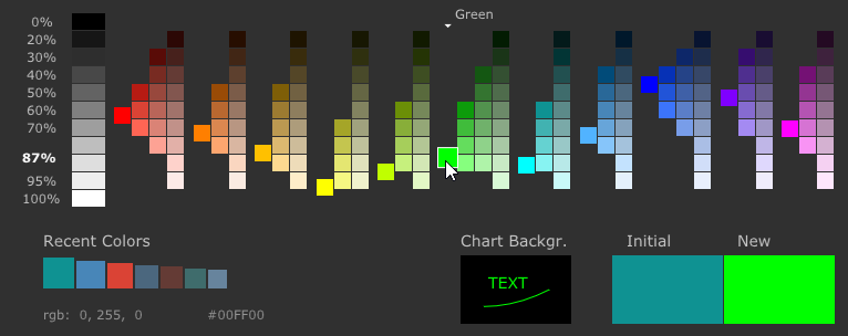
Lightness of colors is key
Color lightness is a number between 0% (black) and 100% (white).
Traditional color spaces such as RGB and HSL do not consider the true color lightness when displaying colors side by side.
For example, pure green (0,255,0) and pure blue (0,0,255) are not interchangeable on a chart because blue (lightness = 45%) is much darker than green (lightness = 87%).
The Sierra++ color palette displays colors with the same level of lightness along the horizontal axis, making it easy to find a color with the right contrast to the background.
Less is better
Typical color pickers offer millions of colors. What first looks like a great feature quickly turns into a complex and click-heavy decision-making process, leading to varying color selections (and, sometimes, frustration or impatience).
Favorite colors can be a solution of great help. However, a typical chart contains dozens of colors, which requires a large number of favorite colors to choose and maintain.
Sierra++ color palette
Sierra++ color palette shows everything on one screen, and requires no more than one click.
It brings :
- the 8 most important hues (
Red,Orange,Yellow,Green,Cyan,Blue,Violet,Magenta) plus 3 additional hues to give more choice (Honey/Gold,Olive/Chartreuseand a lighter blue namedAzure). And of course levels of grey. - 9 levels of lightness between black and white.
- Up to 3 levels of saturation per hue, plus one extra level for
Red,GreenandBluebecause these hues are more frequently used and may require more shades.
These 184 colors sorted by hue, lightness, and saturation, make it easy to select and remember a color :
- Hue is straightforward, no need to think or memorize anything
- Lightness is easy too
- The peak color of each hue is highlighted
- Then for each combination of lightness and hue, there are only 1 or 2 different saturation choices left*
*up to 3 with Red, Green and Blue hues
Instant preview
When hovering a color, you can instantly preview how it will appear against the chart background and within the chart itself.
You need to click on a color to confirm your choice ; otherwise, the color will be reverted to its initial value when you dismiss the picker.
If you want to keep your exact colors
Sierra++ does not alter existing colors unless you click on a color within the Color Picker.
You can hover new colors with the mouse, just don’t click if you want to keep your existing colors as is.